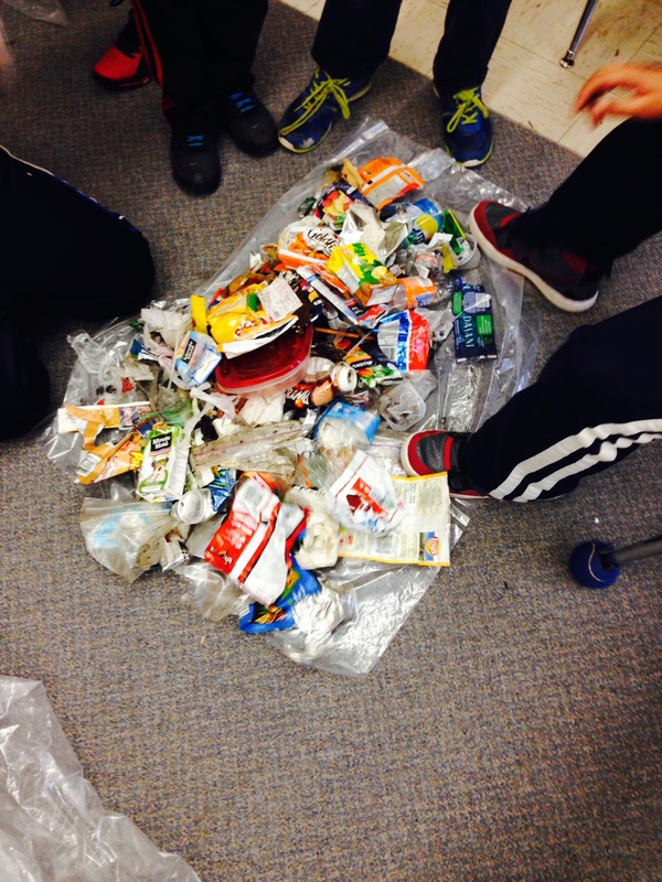
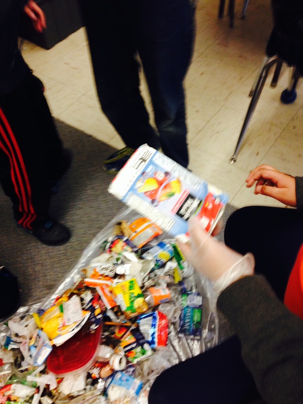
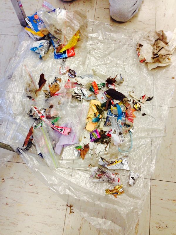
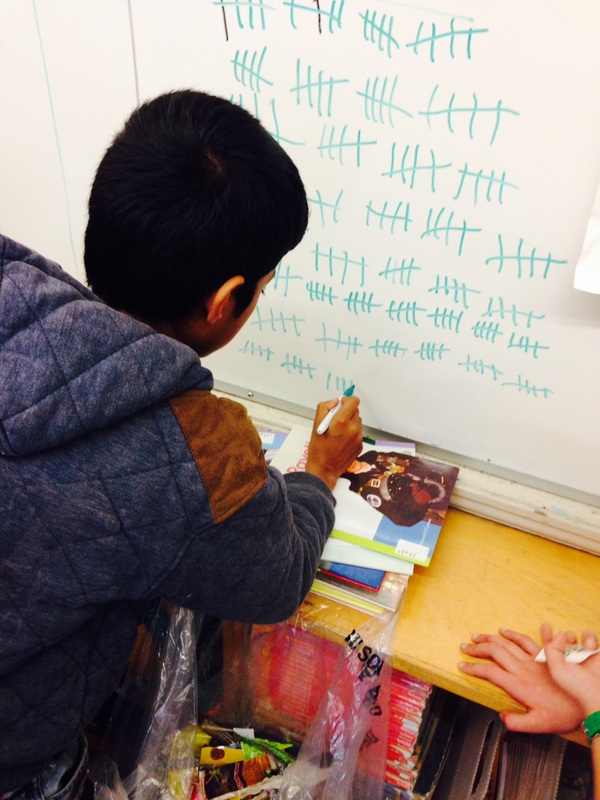
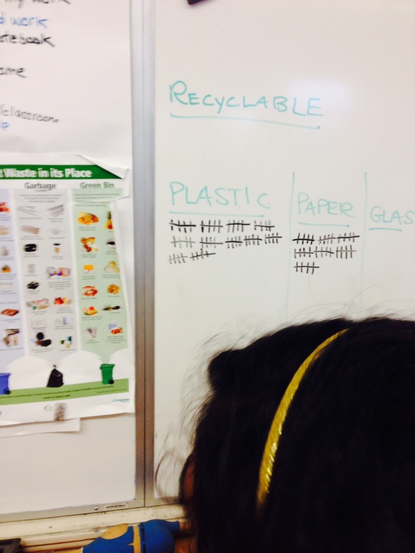
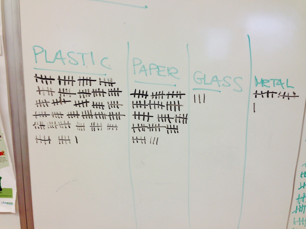
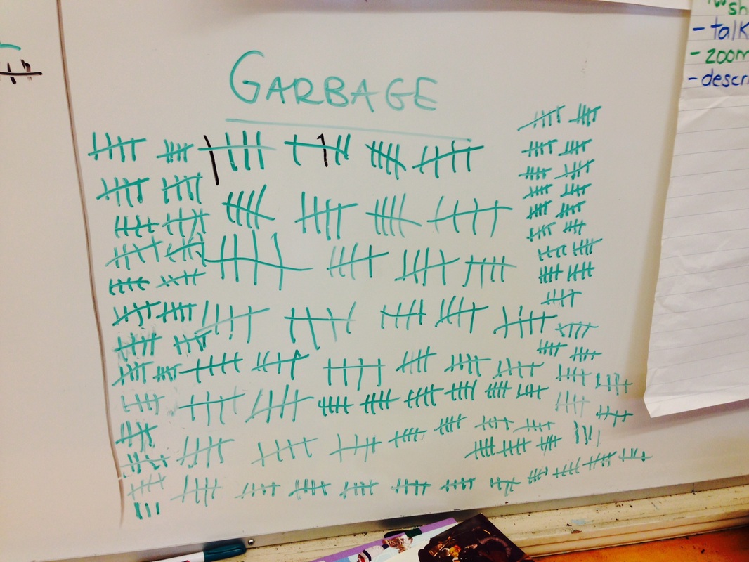
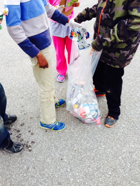
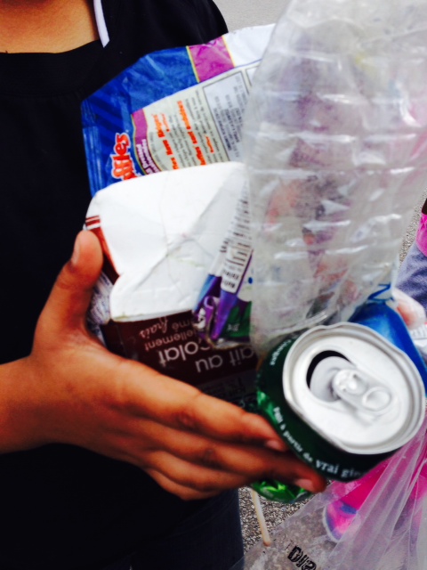
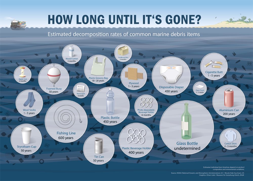
Yesterday on Twitter, I saw the image below and tweeted it out to our followers as it reminded me of the great work that Ms. Fitzsimmons' class did with their infographics on the life cycle of the water bottle.
After tweeting it out, I realized that I have seen and shared many visuals about the impact of pollution on the environment. While I seem to be shocked every time when I think about the statistics contained within, I find that the emotional reaction or shock wears off shortly thereafter.
I had a brief twitter conversation with @VoyagerSopris about the emotional responses that we often have compared to changes to make a lasting impact and this got me thinking. How long do visuals and infographics serve as motivation for a change in our actions? How do we take this information and create lasting change?
@VoyagerSopris also shared The Starfish Story with us. How does this relate to the question? What message can we take away from the story?
Today, please comment on these questions and share your thoughts.